More Resizing Information
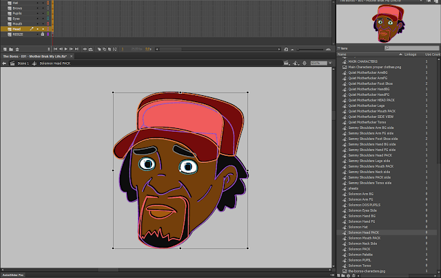
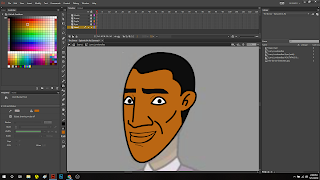
Just so you can see what I'm going through, it's actually pretty interesting. I have to do this for each body part, and it can be particularly difficult if your symbols have symbols within them, assuming you've designed it that way to be intentionally separate.
As you may know, resizing a vector doesn't affect the line size of our line tool (like the pencil tool, for instance), whereas resizing a symbol that has been built with vectors inside it will resize the entire symbol, which will often thin out some of the finer details of the character, often giving the character a cheap or "flash animation" look, which I personally like to avoid when I'm working on projects for someone else.
 On my personal stuff, I don't mind just throwing things together, and for those projects, it's fine to have something look a little off, but not when you're trying to bring someone else's vision to life. You can see in my Rick and Morty SPOOF that even though the characters look great, Morty's left eyeball has a slightly thinner line than the right, even though they both feature the exact same vectors.
_________________________________________________________________________
All rights reserved. More info as the project unfolds! Keep it posted here for more updates on the production of "The Boros."


Comments
Post a Comment